Fonos, the brand for digital voices

A product doesn't begin to be built through its image, but it is the brand that best defines its identity. After a process of research, testing, and learning, we wanted Fonos to represent the values of Monoceros Labs' products in the field of speech technologies.
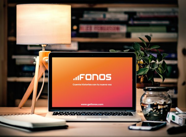
In this article, I'll tell you how we created the visual identity of Fonos, an editor for creating audio content with digital voices in Spanish.
Name
Fonos is a brief name with strong phonetic presence that describes human speech. A phone is a distinguishable sound or gesture of speech, defined by particular acoustic characteristics and a typical duration.

When we proposed the name, after several ideation sessions, we felt that Fonos, in plural and capitalized, was ideal for describing the first family of voice synthesis products from Monoceros Labs.
Typography
The logo typography, Fonos Universal, is specifically designed to be a modern, futuristic, and monospaced font (as it couldn't be otherwise). It's inspired by the Monoceros constellation, which serves as the basis for exploring a new space of creative solutions.

The secondary typeface is what was the free alternative for Monoceros Labs' digital media: Poppins. Prioritizing legibility and accessibility.
Colors
Without ignoring its origin, Fonos creates a new visual identity inheriting traits that associate it with Monoceros Labs, much like how new synthetic voices are created from original samples.
We can see this in the color palette, whose main tones—blue and cherry—are part of the brand's DNA, and to which it incorporates Monoceros yellow and a new shade of orange and purple, derived from a harmonic palette.
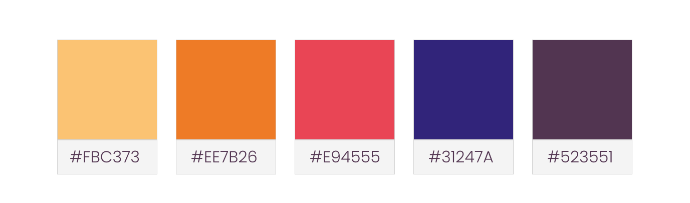
This allows us flexibility to express the brand across different digital media, according to context and needs, without losing nuance and bringing us closer to a more faithful representation of human speech.
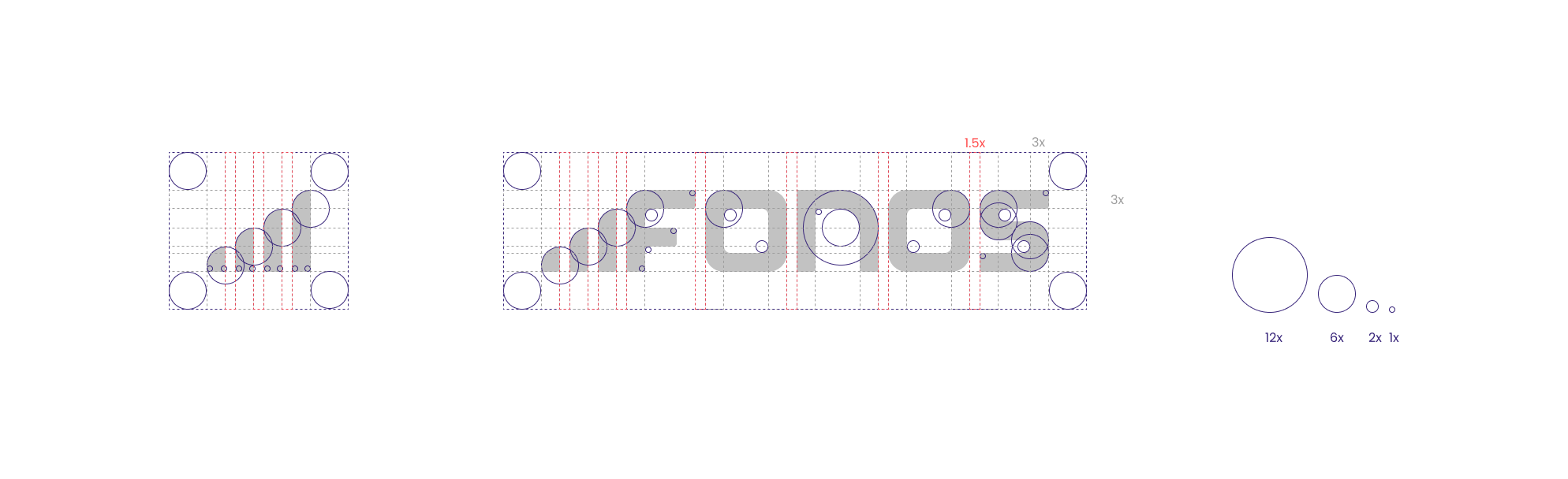
Isotype
The isotype represents two key concepts of a phone: the spectrogram through a non-linear color gradient; and the waveform through its distributed, smooth, and modular composition.


Imagotype
In the final composition, the Fonos name maintains a uniform, stable, recognizable purple tone that gives visual space to the symbol that precedes it.
The geometric construction is based on a constellation of simple circles, respecting each visual segment and connecting them in a grid that remains functional at different sizes.
In sum, Fonos is a brand with exploratory ambition that seeks to represent every nuance of human speech without prejudice and that explores the space of creative and groundbreaking technology.