Data-ink ratio: good design can be better

Data-ink ratio establishes that every pixel used to represent data must be non-redundant and non-erasable, meaning that if the ink is removed from the image, the graphic will lose the content.
That Tufte's principle can be understood very quickly with this example gif image:
On this occasion, I'm going to take a risk and forcing me to find examples on Dribbble, a social network for designers where you can find outstanding visual design examples.
The reason why is because it's easy to see the fail on old and poor designed interfaces, but it's harder to find the 'room of improvement' in those places which already excel.
Disclaimer: I'm not judging the quality and creativity of these designs (which is obvious and I envy), but just trying to do a conscious exercise of critique to identify improvements in the case those designs were meant to be made with the viewer's understanding in mind.
Coloured graphs where the colours bear no meaning
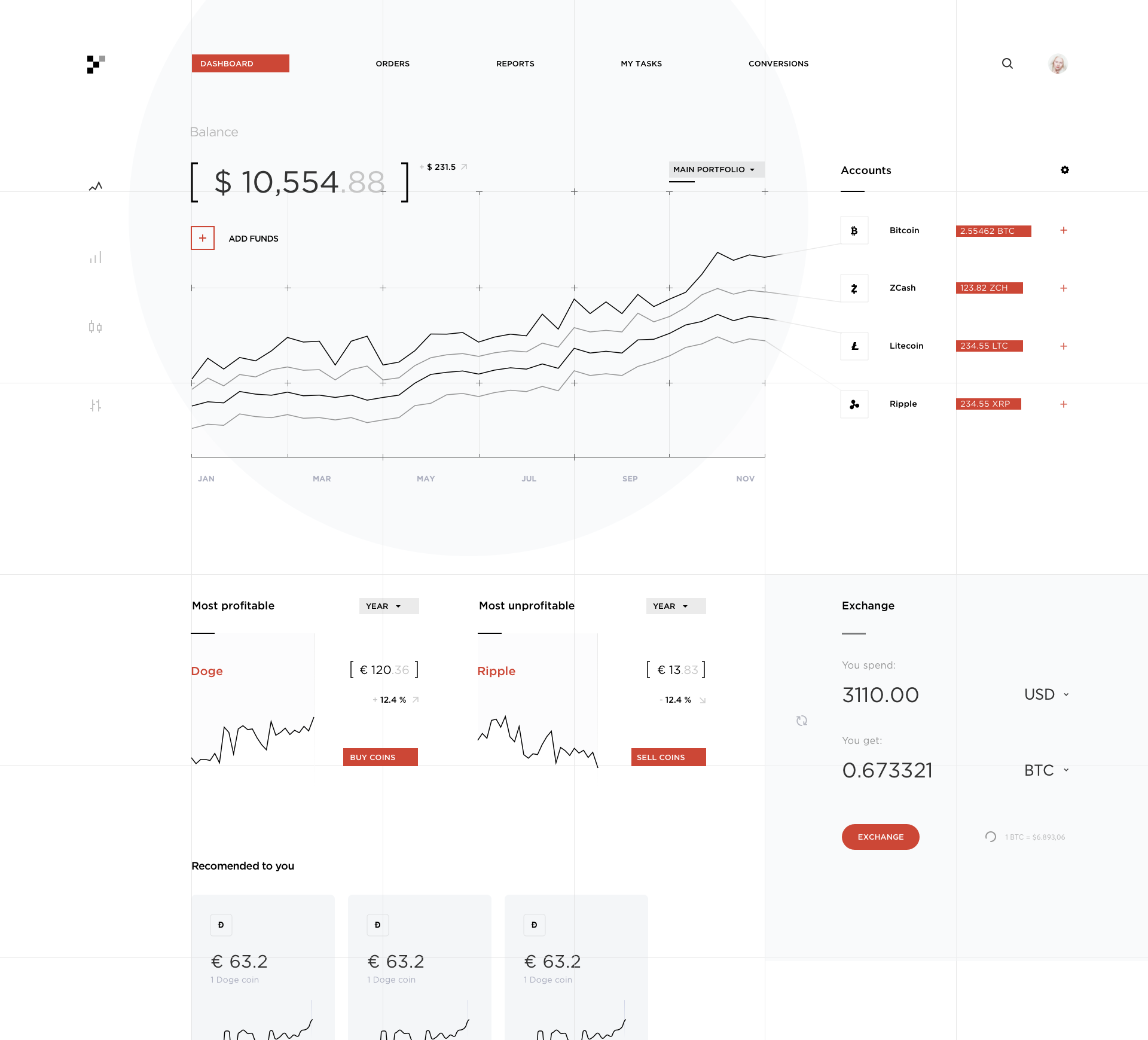
The line-chart displayed on the top left side of the dashboard shows the evolution of a currency through time. Considering that there's no clear meaning associated with any of the values that the currency reaches, we could determine that the colour of the line-chart should be plain and the gradient removed. Same chart with no colour provides exactly the same information.
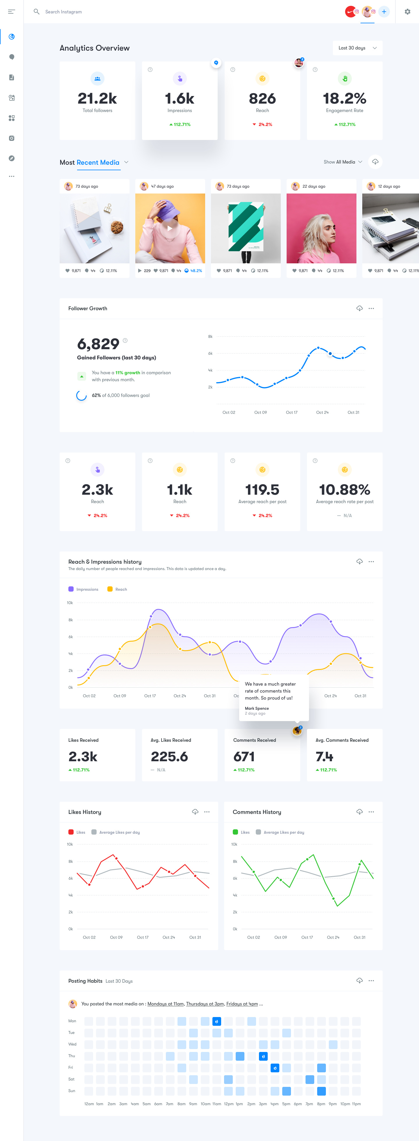
Another example of meaningless colour is shown on the icons included in the 'Analytics Overview' section of this beautiful and almost perfect design. Just using a subtle gray colour for them would make the important information be more prominent.
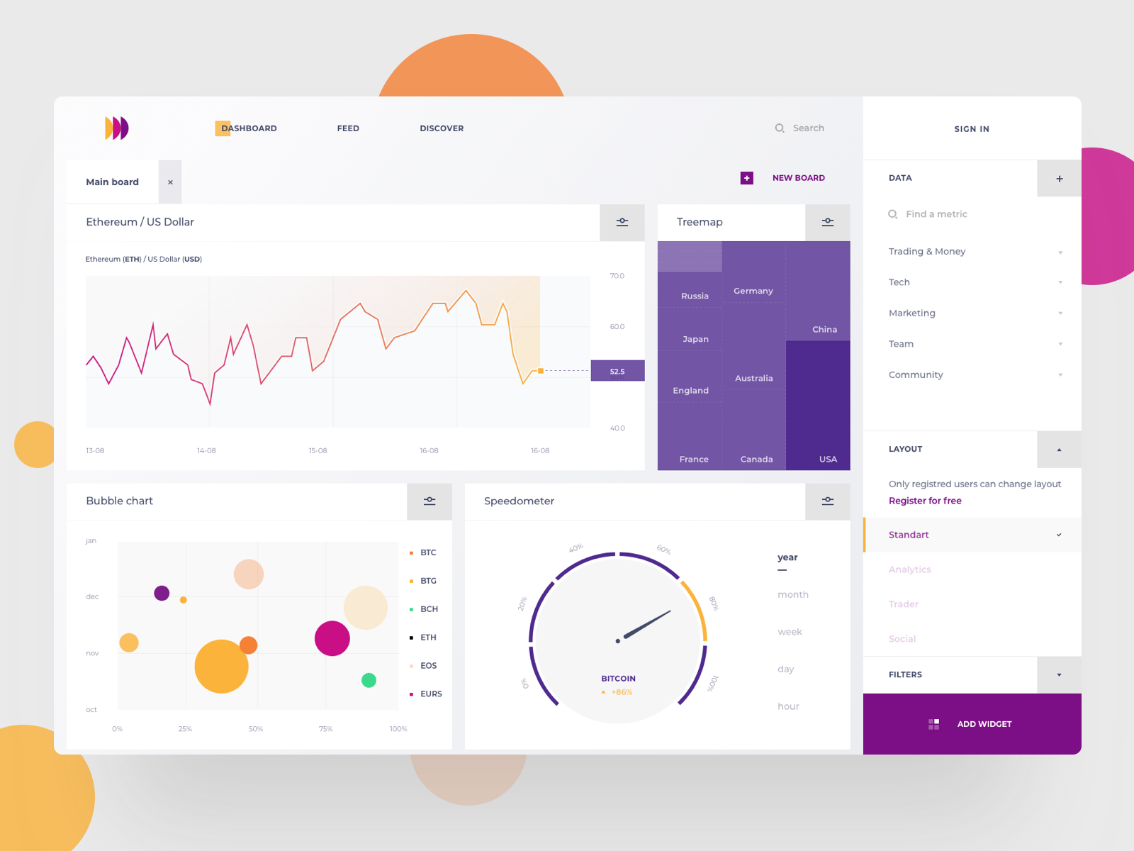
We can find some examples where gradients are used just for a good-looking chart. These make the ink-ratio being not as effective as it could be. Nevertheless, the gauges are unnecessary and they take a considerable amount of ink and space. Considering that those charts are a detailed view of the 'Followers' section that is already represented as a linear evolution, they three could follow same representation with the reference value that they're supposed to reach.
A final example is illustrated in the way the grid is displayed where connectors take an important place just to remark the boundaries of the chart that have been off the limits. Just by limiting grid lines to the chart would have been enough. But of course, it would have been a more boring dashboard.